Using the right font can be trickier than you may think, just ask CERN. Known as the European Organisation for Nuclear Research, CERN made a breakthrough discovery in 2012 of the Higgs boson – a key particle in the world of physics – and proceeded to announce their discovery using a Comic Sans typeface.
The idea to announce one of the largest scientific discoveries of all time using a typeface usually reserved for comic books was one that caused a stir. As pictures of the highly anticipated presentation were beamed across Twitter, readers struggled to link the wealth of research on the show and the breezy light-hearted attitude of the fonts that they were presented in.
CERN’s actions caused something of a debate on how imperative the right use of the font is in presentations that still resonates to this day. So let’s take a look at what’s in a font. Here’s a list of things to consider when constructing a presentation for your colleagues, employees, peers or students.

Serif vs Sans Serif
Serif and sans serif are no doubt words you’re familiar with, but not everybody knows what they mean.
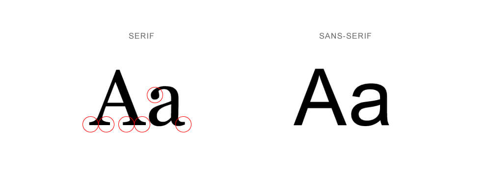
In typography, serifs are the small lines or strokes that can typically be found at the ends of letters. They’re the little flicks and accents that can often be seen in fonts like Times New Roman and Georgia.
Sans serif fonts, put simply, do not have the flicks and accents that its serif counterparts have.
An example of a popular sans serif font is Arial and Verdana.
Now you’re equipped with this information you may be wondering why something so trivial should be included as a talking point in this article, but the effects of these typeface types extend far deeper than their collective visages.
Psychologically, serif and sans serif fonts can carry significantly different degrees of readability over their counterparts. This is down to the accents showcased in serif fonts, the strokes on the end of each letter help guide the readers’ eyes across the body of text and lead them onto the next letter – enabling them to subconsciously read large passages of writing with considerably less effort than the sans alternative.
While the flowing structure of serif fonts can be a significant advantage when delivering presentations that require longer quotations and written passages, the sans serif font can become your best friend should you need to deliver short, snappy, memorable pieces of information.
Because sans serif fonts don’t carry the accents that guide eyes from word to word faster, they can help readers focus on succinct sentences better, and for longer too. This can be especially effective if you’re looking to utilize bullet points in your presentation.
Keep on message
Branding is becoming something of a lazy marketing word in this day and age, but establishing a theme filled with the type of typography that matches your business or is in keeping with your content is vital for your audience.
When an audience is hit with a multitude of slides in quick succession, it’s important not to undermine their familiarity with the formats you’re using. When a slide may only stay on view for a matter of seconds, you can’t afford to waste time in having the reader pause to familiarise themselves.
Keep your fonts consistent and suitable for your business branding. If you’re a forward-thinking technologically advanced company, it wouldn’t make much sense pitching to clients with a presentation that’s comprised of cursive-style fonts. However, if you’re a small business that specializes in antiques, it could perhaps be more beneficial to utilize a more vintage typeface when training staff. It’s all about finding a text that’s consistent enough with your branding to keep your audience comfortable.
Build a mood
While we’re on the topic of comfort, it’s vital to establish a mood within your presentation, and the correct use of text can play a key role in this.
CERN quickly found out that their Comic Sans choice of font in presenting information created a jovial mood among readers around the world. So much so that the organization acknowledged this by joking that it would adopt the cartoonish font for all of its communications as an April Fools’ gag.
While the discovery of the Higgs boson made global news for its significance, CERN risked trivializing its accomplishment with its choice of font, and indeed could well have done so if the subject matter was initially perceived as less significant.
Remember that your choice of font is an excellent way of broadcasting your mood to your audience. Keep your text sleek and sharp to convey a formal message, or more curvey and arched in a training situation to relax your trainees. Never undermine your content by picking an ill-fitting typeface.
To help you along with your choice of text, there are plenty of online tools and websites at your disposal that can help you build an engaging presentation:
- Canva – allows you to easily design decks and graphics
- PoweredTemplate – a collection of 15,000+ templates
- Piktochart – a tool that allows you to visualise data
- Google Fonts – a collection of over 900 family fonts
- Envato Elements Fonts – a collection of 3,800+ custom fonts
With these tools and resources, you should be able to create a presentation that leaves an impression and stays with your audience long after it’s finished.
